
Pantone created a new color for its much-anticipated Color of the Year program, one that represents the world’s current transformative times, the company says.
Very Peri (PANTONE 17-3938) encompasses the qualities of the blues and possesses a violet-red undertone and “displays a spritely, joyous attitude and dynamic presence that encourages courageous creativity and imaginative expression.”
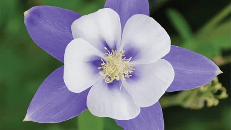
Think: Aquilegia coerulea or Crayola Periwinkle.
The Pantone Color Institute provided this flowery (no pun intended) description of its newest creation and choice:
“Displaying a carefree confidence and a daring curiosity that animates our creative spirit, inquisitive and intriguing PANTONE 17-3938 Very Peri helps us to embrace this altered landscape of possibilities, opening us up to a new vision as we rewrite our lives. Rekindling gratitude for some of the qualities that blue represents complemented by a new perspective that resonates today, PANTONE 17-3938 Very Peri places the future ahead in a new light.”
This marks the first time that the company created a color for its Color of the Year program, which began in 2000.
“The Pantone Color of the Year reflects what is taking place in our global culture, expressing what people are looking for that color can hope to answer,” says Laurie Pressman, vice president of the Pantone Color Institute. “Creating a new color for the first time in the history of our Pantone Color of the Year educational color program reflects the global innovation and transformation taking place. As society continues to recognize color as a critical form of communication, and a way to express and affect ideas and emotions and engage and connect, the complexity of this new red violet infused blue hue highlights the expansive possibilities that lay before us.”
In a nod to the transformation taking place across the globe, the Pantone Color Institute calls Veri Peri “a symbol of the global zeitgeist of the moment and the transition we are going through.
“As we emerge from an intense period of isolation, our notions and standards are changing, and our physical and digital lives have merged in new ways. Digital design helps us to stretch the limits of reality, opening the door to a dynamic virtual world where we can explore and create new color possibilities. With trends in gaming, the expanding popularity of the metaverse and rising artistic community in the digital space PANTONE 17-3938 Very Peri illustrates the fusion of modern life and how color trends in the digital world are being manifested in the physical world and vice versa.”
Pantone took a hard right and veered away from the greens that many companies chose as their colors of the year, including October Mist by Benjamin Moore, Evergreen Fog by Sherwin-Williams, Guacamole by Glidden, Breezeway by Behr and Olive Sprig by PPG.
Growers and garden retailers have a bevy of flower choices to market alongside the Color of the Year hoopla. A short list: Aster (now Symphyotrichum), Phlox, Clematis, Matthiola, Platycodon, Agapanthus, Hydrangea, Nepeta, Calluna and Buddleia.

Explore the February 2022 Issue
Check out more from this issue and find your next story to read.
Latest from Greenhouse Management
- North Carolina Nursery & Landscape Association announces new executive vice president
- Plant Development Services, Inc. unveils plant varieties debuting in 2025
- Promo kit available to celebrate first National Wave Day on May 3
- Applications now open for American Floral Endowment graduate scholarships
- Endless Summer Hydrangeas celebrates 20 years with community plantings
- Invest in silver
- Garden Center magazine announces dates for 2025 Garden Center Conference & Expo
- USDA launches $2 billion in aid for floriculture growers